
11. Matplotlib#
In this section, we will learn how to use Matplotlib to create plots. Matplotlib is a plotting library for the Python programming language and its numerical mathematics extension NumPy. It provides an object-oriented API for embedding plots into applications using general-purpose GUI toolkits like Tkinter, wxPython, Qt, or GTK. It is widely used to visualize data and is very useful for data analysis and machine learning.
11.1. Installation and Setup#
To install Matplotlib, you can use pip, a package manager for Python. Run the following command in your terminal:
pip install matplotlib
To verify that Matplotlib is installed, you can run the following command in your terminal:
pip show matplotlib
To use Matplotlib, you need to import it. You can import it using the following command:
import matplotlib.pyplot as plt
Bare in mind that in some jupyter notebooks, you may need to use the following command to display the plots:
import matplotlib.pyplot as plt
%matplotlib inline
11.2. Creating a Plot#
In this section we will see how to create a simple plot using Matplotlib. We will create a simple line plot using the plot function. The plot function takes two arguments, the x-axis and the y-axis. The x-axis is the independent variable and the y-axis is the dependent variable. The plot function will plot the y-axis against the x-axis.
import matplotlib.pyplot as plt

x = [1, 2, 3, 4, 5]
y = [2, 3, 4, 5, 6]

plt.figure(figsize=(10, 5)) # Create a figure with a size of 10x5, width x height
plt.plot(x, y) # Create a line plot
plt.show() # Show the plot
The example gives as a output:
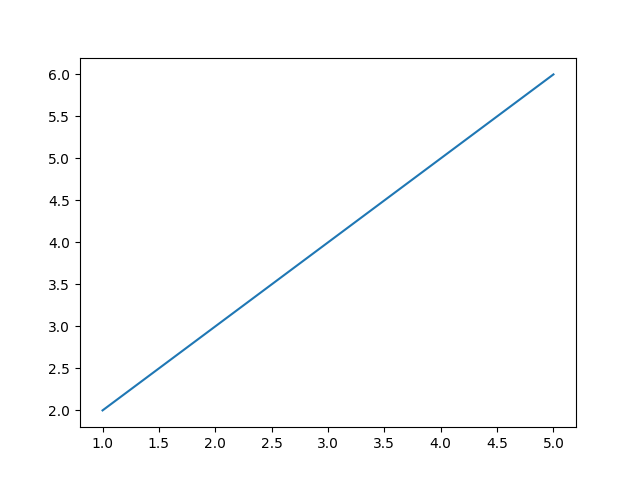
Fig. 11.1 Output of the plot#
We can also produce a scatter plot using the scatter function. The scatter function takes two arguments, the x-axis and the y-axis. The scatter function will plot the y-axis against the x-axis.
import matplotlib.pyplot as plt

x = [1, 2, 3, 4, 5]
y = [2, 3, 4, 5, 6]
plt.figure(figsize=(10, 5)) # Create a figure with a size of 10x5, width x height
plt.scatter(x, y) # Create a scatter plot
plt.show() # Show the plot
The example gives as a output:
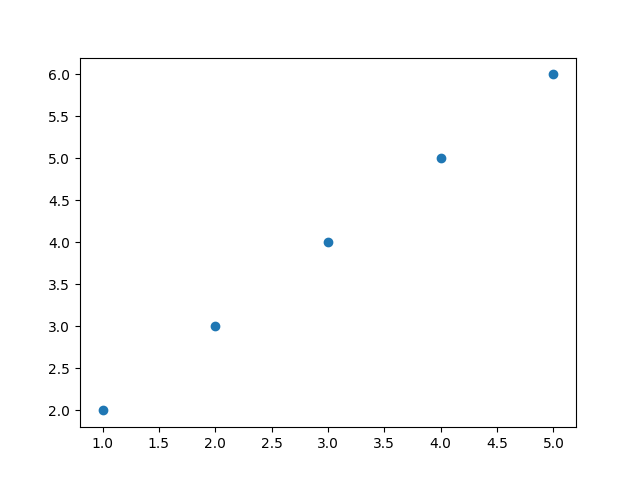
Fig. 11.2 Output of the scatter plot#
We can also draw 3D plots using the plot function. The plot function takes three arguments, the x-axis, the y-axis, and the z-axis. The plot function will plot the z-axis against the x-axis and the y-axis.
import matplotlib.pyplot as plt
import numpy as np
np.random.seed(42)
# This part is necessary to create the 3D plot
fig = plt.figure(figsize=(10, 5)) # Create a figure with a size of 10x5, width x height
ax = fig.add_subplot(111, projection='3d') # Create a 3D axis, 111 means 1x1 grid, first subplot, projection='3d' means 3D plot

x = np.random.standard_normal(100) # Create random data
y = np.random.standard_normal(100) # Create random data
z = np.random.standard_normal(100) # Create random data

ax.scatter(x, y, z) # Create a 3D scatter plot
plt.show() # Show the plot
The example gives as a output:
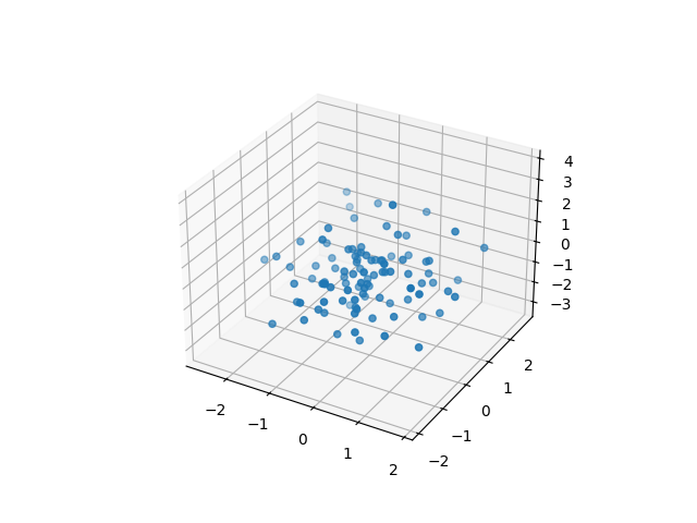
Fig. 11.3 Output of the 3D plot#
Also, we can produce a bar plot using the bar function. The bar function takes two arguments, the x-axis and the y-axis. The bar function will plot the y-axis against the x-axis.
import matplotlib.pyplot as plt

x = [1, 2, 3, 4, 5]
y = [2, 3, 4, 5, 6]

plt.figure(figsize=(10, 5)) # Create a figure with a size of 10x5, width x height
plt.bar(x, y) # Create a bar plot
plt.show() # Show the plot
The example gives as a output:
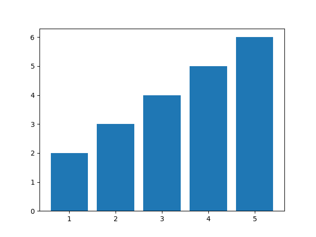
Fig. 11.4 Output of the bar plot#
Finally, we can produce a histogram using the hist function. The hist function takes one argument, the data. The hist function will plot the frequency of the data.
import matplotlib.pyplot as plt
import numpy as np
np.random.seed(42)
data = np.random.randn(1000) # Create random data

plt.hist(data, bins=30) # Create a histogram with 30 bins. Here bins are the number of intervals in the data, and it is a parameter of the histogram
                        # if bins is too small, the histogram will be too smooth, and if bins is too large, the histogram will be too spiky

plt.show() # Show the plot
The example gives as a output:
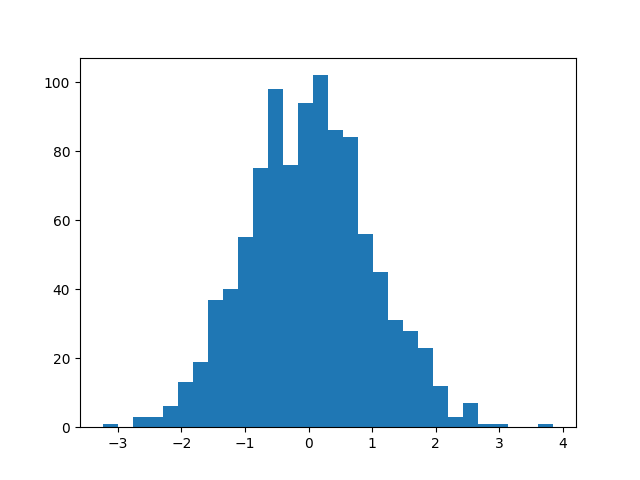
Fig. 11.5 Output of the histogram#
This kind of plot is useful to visualize the distribution of the data.
11.3. Customizing the Plot#
In this section we will see how to customize the plot using Matplotlib. We will see how to add a title, labels, and a legend to the plot. Also, we will see how to change the color, the line style, and the marker style of the plot.
11.3.1. Adding a Title#
To add a title to the plot, you can use the title function. The title function takes one argument, the title of the plot.
import matplotlib.pyplot as plt

x = [1, 2, 3, 4, 5]
y = [2, 3, 4, 5, 6]
plt.figure(figsize=(10, 5)) # Create a figure with a size of 10x5, width x height
plt.plot(x, y) # Create a line plot
plt.title('Simple Line Plot') # Add a title to the plot
plt.show() # Show the plot
The example gives as a output:
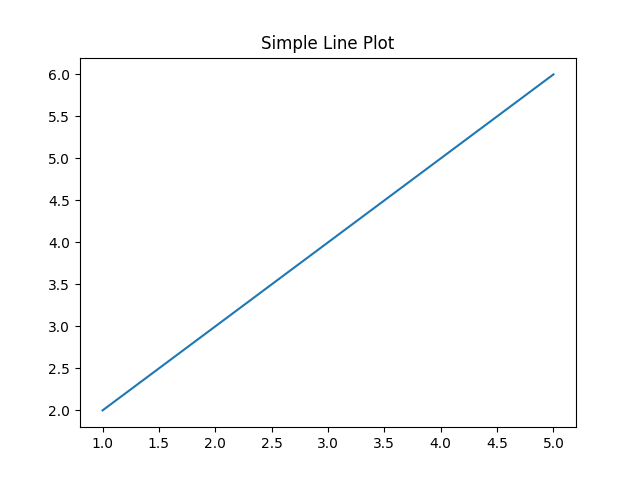
Fig. 11.6 Output of the title#
11.3.2. Adding Labels#
To add labels to the x-axis and y-axis, you can use the xlabel and ylabel functions. The xlabel and ylabel functions take one argument, the label of the x-axis and y-axis, respectively.
import matplotlib.pyplot as plt

x = [1, 2, 3, 4, 5]
y = [2, 3, 4, 5, 6]
plt.figure(figsize=(10, 5)) # Create a figure with a size of 10x5, width x height
plt.plot(x, y)
plt.xlabel('X-axis')
plt.ylabel('Y-axis')
plt.show()
The example gives as a output:
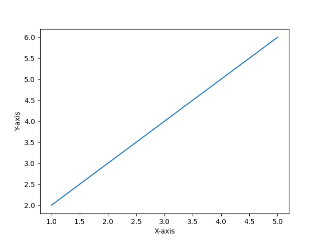
Fig. 11.7 Output of the labels#
11.3.3. Adding a Legend#
To add a legend to the plot, you can use the legend function. The legend function takes one argument, the label of the plot.
import matplotlib.pyplot as plt

x = [1, 2, 3, 4, 5]
y = [2, 3, 4, 5, 6]
plt.figure(figsize=(10, 5)) # Create a figure with a size of 10x5, width x height
plt.plot(x, y, label='Line 1')
plt.legend()
plt.show()
The example gives as a output:
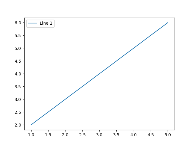
Fig. 11.8 Output of the legend#
11.3.4. Changing the Color, Line Style, and Marker Style#
To change the color, the line style, and the marker style of the plot, you can use the color, linestyle, and marker arguments of the plot function, respectively.
import matplotlib.pyplot as plt
x = [1, 2, 3, 4, 5]
y = [2, 3, 4, 5, 6]

plt.figure(figsize=(10, 5)) # Create a figure with a size of 10x5, width x height
plt.plot(x, y, color='red', linestyle='--', marker='o')

plt.show()
The example gives as a output:
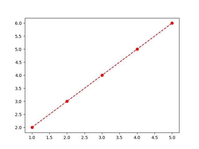
Fig. 11.9 Output of the custom#
11.4. Multiple Plots#
11.4.1. Raw version#
In matplotlib, you can create multiple plots in the same figure using the subplot function. The subplot function takes three arguments, the number of rows, the number of columns, and the index of the plot.
import matplotlib.pyplot as plt

x = [1, 2, 3, 4, 5]
y = [2, 3, 4, 5, 6]
plt.figure(figsize=(10, 5)) # Create a figure with a size of 10x5, width x height
plt.subplot(1, 2, 1)
plt.plot(x, y)

plt.subplot(1, 2, 2)
plt.scatter(x, y)

plt.show()
The example gives as a output:
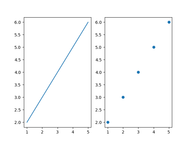
Fig. 11.10 Output of the multiple plots#
11.4.2. Formatted version#
One of the best ways of creating multiple plots is using fig and ax objects. This way, you can create a figure and multiple axes, and then plot in each axis.
import matplotlib.pyplot as plt

x = [1, 2, 3, 4, 5]
y = [2, 3, 4, 5, 6]

fig, ax = plt.subplots(1, 2, figsize=(10, 5)) # Create a figure and 2 axes. Note that figsize is the size of the figure
ax[0].plot(x, y, label='Line 1') # Plot in the first axis, and add a label
ax[0].set_title('Line Plot') # We can also add a title to the plot
# We can also add labels to the x-axis and y-axis
ax[0].set_xlabel('X-axis')
ax[0].set_ylabel('Y-axis')
# We can also change the color, the line style, and the marker style of the plot
ax[0].plot(y, x, color='red', linestyle='dashdot', marker='x', label='Line 2')
# We can also add a legend to the plot
ax[0].legend(['Line 1', 'Line 2'])

ax[1].scatter(x, y, label='Scatter 1') # Plot in the second axis
ax[1].set_title('Scatter Plot')
ax[1].set_xlabel('X-axis')
ax[1].set_ylabel('Y-axis')
ax[1].scatter(y, x, color='green', marker='o', label='Scatter 2')
ax[1].legend(['Scatter 1', 'Scatter 2'])
plt.show()
The example gives as a output:
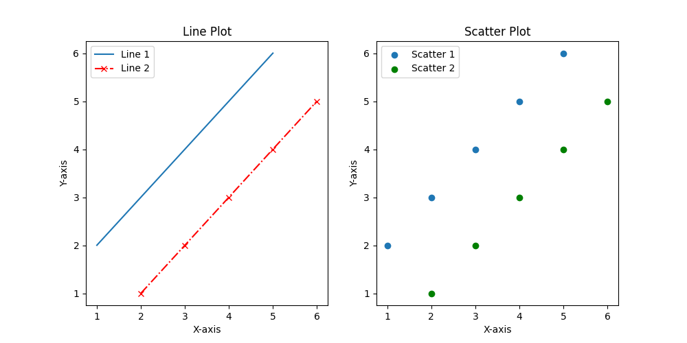
Fig. 11.11 Output of the multiple plots#
As you can see, the fig and ax objects are very useful to create multiple plots in the same figure. Note that this plot was more customized than the previous one. So, do not hesitate to use the fig and ax objects to create your plots, and visit the Matplotlib documentation to learn more about the customization of the plots.
Before we leave this section, we will see how to save the plots to a file. You can use the savefig function to save the plots to a file. The savefig function takes one argument, the name of the file.
import matplotlib.pyplot as plt

x = [1, 2, 3, 4, 5]
y = [2, 3, 4, 5, 6]
plt.figure(figsize=(10, 5)) # Create a figure with a size of 10x5, width x height
plt.plot(x, y)
plt.savefig('plot.png')
The example saves the plot to a file called plot.png.
11.5. Seaborn and Matplotlib, a perfect combination#
Seaborn is a Python data visualization library based on Matplotlib. It provides a high-level interface for drawing attractive and informative statistical graphics. Seaborn is very useful to visualize complex data, and it is widely used in data analysis and machine learning.
11.5.1. Installation and Setup#
To install Seaborn, you can use pip, a package manager for Python. Run the following command in your terminal:
pip install seaborn
To verify that Seaborn is installed, you can run the following command in your terminal:
pip show seaborn
To use Seaborn, you need to import it. You can import it using the following command:
import seaborn as sns
11.5.2. Creating a Plot#
In this section we will see how to create a simple plot using Seaborn. We will create a simple line plot using the lineplot function. The lineplot function takes two arguments, the x-axis and the y-axis. The x-axis is the independent variable and the y-axis is the dependent variable. The lineplot function will plot the y-axis against the x-axis.
import seaborn as sns
import matplotlib.pyplot as plt

x = [1, 2, 3, 4, 5]
y = [2, 3, 4, 5, 6]

plt.figure(figsize=(10, 5)) # Create a figure with a size of 10x5, width x height
sns.lineplot(x=x, y=y, label='Line 1', color='red', linestyle='--') # Create a line plot
plt.show() # Show the plot
The example gives as a output:
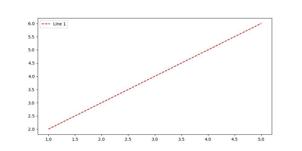
Fig. 11.12 Output of the Seaborn plot#
Also, bar plots, scatter plots, and histograms can be created using Seaborn. The barplot, scatterplot, and histplot functions take two arguments, the x-axis and the y-axis. The barplot function will plot the y-axis against the x-axis, the scatterplot function will plot the y-axis against the x-axis, and the histplot function will plot the frequency of the data.
import seaborn as sns
import matplotlib.pyplot as plt

x = [1, 2, 3, 4, 5]
y = [2, 3, 4, 5, 6]

plt.figure(figsize=(10, 5)) # Create a figure with a size of 10x5, width x height
sns.barplot(x=x, y=y, color='blue', alpha=0.9, linewidth=2, edgecolor='black', capsize=0.2) # Create a bar plot, and customize it (color, transparency, linewidth, edgecolor, capsize)
plt.show() # Show the plot
The example gives as a output:
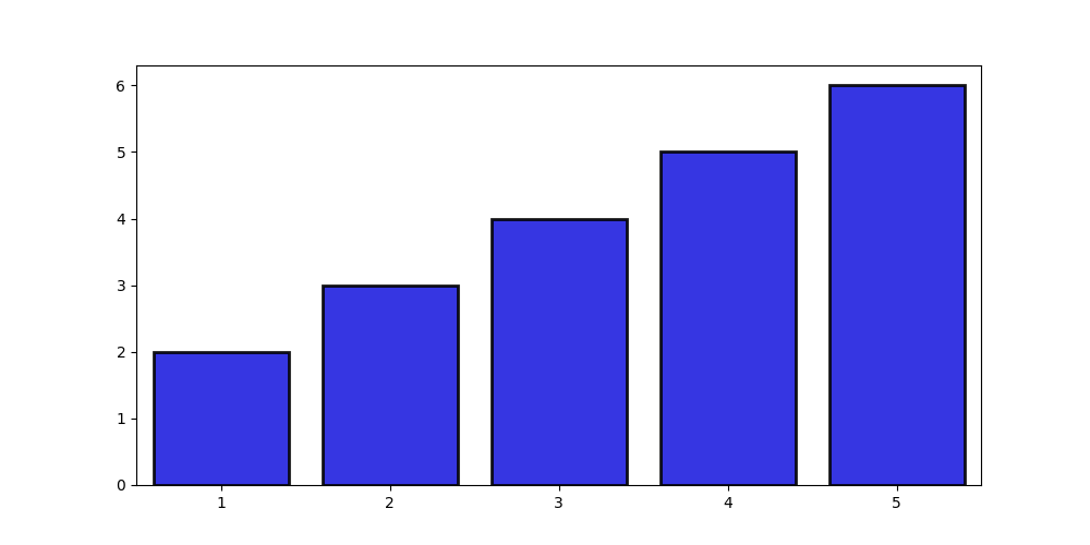
Fig. 11.13 Output of the Seaborn bar plot#
import seaborn as sns
import matplotlib.pyplot as plt

x = [1, 2, 3, 4, 5]
y = [2, 3, 4, 5, 6]

plt.figure(figsize=(10, 5)) # Create a figure with a size of 10x5, width x height
sns.scatterplot(x=x, y=y, color='green', marker='o', s=100, edgecolor='black', linewidth=2) # Create a scatter plot, and customize it (color, marker, size, edgecolor, linewidth)

plt.show() # Show the plot
The example gives as a output:
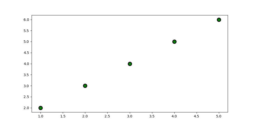
Fig. 11.14 Output of the Seaborn scatter plot#
import seaborn as sns
import matplotlib.pyplot as plt
import numpy as np
np.random.seed(42)
data = np.random.randn(1000) # Create random data

plt.figure(figsize=(10, 5)) # Create a figure with a size of 10x5, width x height
sns.histplot(data, bins=30, kde=True, color='orange', edgecolor='black', linewidth=2) # Create a histogram with 30 bins, and customize it (color, kde, edgecolor, linewidth)
plt.show() # Show the plot
The example gives as a output:
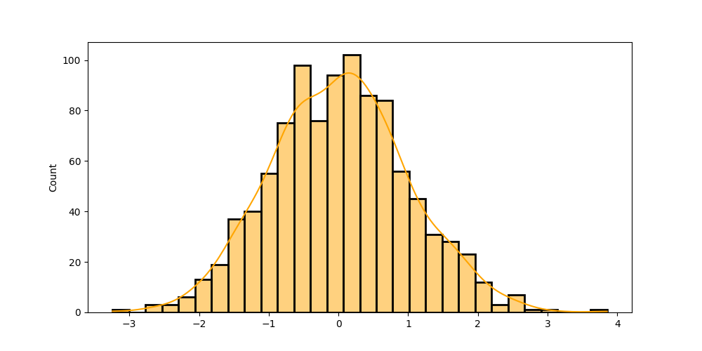
Fig. 11.15 Output of the Seaborn histogram#
11.5.3. Multiple Plots#
In Seaborn, you can create multiple plots in the same figure using the subplots function. The subplots function takes two arguments, the number of rows and the number of columns.
import seaborn as sns
import matplotlib.pyplot as plt

x = [1, 2, 3, 4, 5]
y = [2, 3, 4, 5, 6]

fig, ax = plt.subplots(1, 2, figsize=(10, 5)) # Create a figure and 2 axes. Note that figsize is the size of the figure
sns.lineplot(x=x, y=y, label='Line 1', color='red', linestyle='--', ax=ax[0]) # Plot in the first axis, and add a label
ax[0].set_title('Line Plot') # We can also add a title to the plot
# We can also add labels to the x-axis and y-axis
ax[0].set_xlabel('X-axis')
ax[0].set_ylabel('Y-axis')
# We can also change the color, the line style, and the marker style of the plot
sns.lineplot(y, x, color='blue', linestyle='dashdot', ax=ax[0], label='Line 2')
# We can also add a legend to the plot
ax[0].legend(['Line 1', 'Line 2'])

sns.scatterplot(x=x, y=y, color='green', marker='o', ax=ax[1], label='Scatter 1') # Plot in the second axis
ax[1].set_title('Scatter Plot')
ax[1].set_xlabel('X-axis')
ax[1].set_ylabel('Y-axis')
sns.scatterplot(y, x, color='orange', marker='x', ax=ax[1], label='Scatter 2')
ax[1].legend(['Scatter 1', 'Scatter 2'])
plt.show()
The example gives as a output:
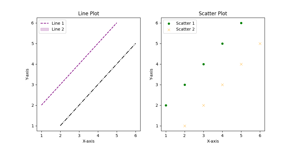
Fig. 11.16 Output of the Seaborn multiple plots#
As you can see, Seaborn is very useful to visualize complex data, and it is widely used in data analysis and machine learning. Do not hesitate to use Seaborn to visualize your data, and visit the Seaborn documentation to learn more about the customization of the plots.
11.6. Conclusion#
In this section, we have learned how to use Matplotlib to create plots. We have seen how to create a simple plot, a scatter plot, a 3D plot, a bar plot, and a histogram. Also, we have seen how to customize the plot using Matplotlib. We have seen how to add a title, labels, and a legend to the plot. Also, we have seen how to change the color, the line style, and the marker style of the plot. We have also learned how to create multiple plots in the same figure using Matplotlib. Finally, we have learned how to use Seaborn to create plots. We have seen how to create a simple plot, a bar plot, a scatter plot, and a histogram using Seaborn. Also, we have seen how to create multiple plots in the same figure using Seaborn. We hope that this section has been useful to you, and we encourage you to use Matplotlib and Seaborn to visualize your data.
11.7. Exercises#
This time is different. We will be ask you to summarize the content of this section. We will ask you also to create a Jupyter Notebook and create 4 different plots of your choice using Matplotlib and Seaborn. The data that you will use to create the plots is the dataframe that you have already created in the previous section.
Hint
It is a good idea to use the fig and ax objects to create the plots. Also, it is a good idea to use the subplots function to create multiple plots in the same figure. Also remember to use the savefig function to save the plots to a file.
Also I encourage you to visit the Matplotlib documentation and the Seaborn documentation to learn more about the customization of the plots.